Understand The Science
The Idea
My mom has deuteranopia (form of red-green color blindness), and on our trips she'd always squint at transit maps, unable to tell the lines apart. That is because she has difficulty distinguishing between red and green colors.
How I see it

How she sees it
Then I realized: if I could generate palettes optimized for both normal vision and deuteranopia, I could try to make maps more usable.
The Science
When I set out to built this generator, I knew I had to figure out 3 things:
- A color space where numbers match perception.
- A simulation of color vision deficiency (CVD).
- An optimization that keeps colors “far apart”.
1. Why Oklab?
Oklab is a perceptual color space designed so that equal numerical moves correspond to equal perceived shifts in hue, chroma, or lightness. In sRGB, two colors with the same coordinate difference can look wildly different to our eyes, but in Oklab, Euclidean distance lines up with how we actually see. That makes it perfect for measuring and maximizing “visual distance” between any two palette entries.
2. Simulating Color Vision Deficiency (CVD)
To recreate deuteranopia, and other forms of color-blindness, I paired Culori ’s color-space conversions with the color-blind library. This combo gives an exact preview of how each swatch appears to viewers with CVD.
3. Maximin Optimization
Rather than simply spreading colors evenly, I posed a “maximin” problem: pick n points in Oklab such that the smallest pairwise distance, checked under both true-color and simulated-color views, is as large as possible. That worst-case guarantee ensures no two lines on your map ever look confusingly similar, no matter who’s looking.
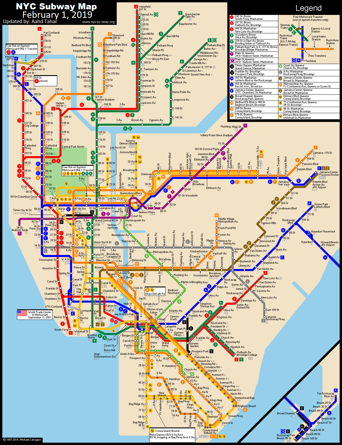
Results
The objective was to test whether a Delta Palette-generated color set improves route separability for users with deuteranopia compared with the standard NYC subway colors.
Here's how the map looks after applying a 12-color palette generated by my code:

Normal Vision

Deuteranopia
In the simulated view, red/green trunk lines previously merged into a single olive tone; the new palette separates them into distinct steel-blue and dusty-green.
Experiment with my friend with partial red-green color blindness:
Final Thoughts
Although improving transit‐map legibility for users with deuteranopia was my primary motivation, the underlying Delta Palette generator can be applied to many other contexts where color separability matters. By ensuring each hue is maximally distinct in both normal vision and CVD simulations, you can make any visualization or interface more accessible.
Other Potential Applications:
- Educational Materials: Diagrams, instructional posters, or textbooks often use colored regions to convey meaning; optimizing those colors can help students with partial color blindness follow along without confusion.
- UI Theming & Design Systems: Any design system that relies on color coding (buttons, alerts, badges) can benefit from a CVD‐friendly palette so that interactive elements remain clear for all users.
- Building Floorplans & Evacuation Routes: Emergency signage or interactive floorplans that rely on multiple colors (e.g., exit paths, hazard zones) can use something like this to guarantee legibility for safety instructions.
Credits
Built and maintained by Felipe Min.
Useful Resources:
- Oklab perceptual color space
- Culori for color conversions
- color-blind simulation algorithms based on established research
- MAXDISTCOLOR greedy algorithm that generates distinctly separated colors